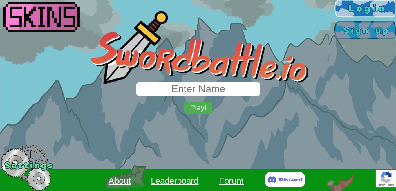
New Title Concept:

Here it is on the title screen. (Ignore the broken backround)
Please share your thoughts and opinions so I can improve it and make the best title for Swordbattle.io.
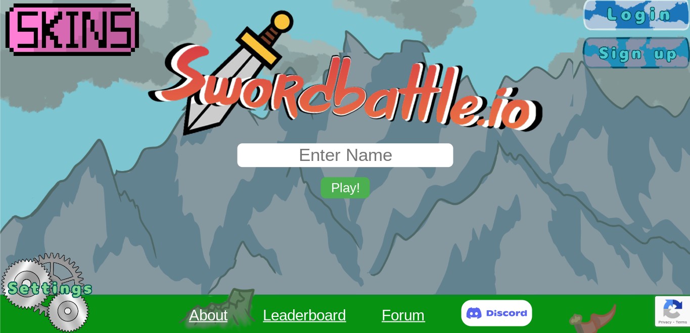
New Title Concept:
tbh it looks better
except for teh part u made look 3D it makes it liek its curved make it face one way
(we also need a new skin button tbh)
Maybe instead of the a have the default player skin with a sword going into him
Yes, definitely.
absolutley!
Hue it’s cool but u see the d and the b . That could be better cause it …
new skins button

The concept seems very good, just one slight issue with this, its sideways and the text is sideways. I think this might break when being added.
the textbox isnt sideways tho…
Why is it tileted. Imma kill u color
I cant unsee it. I hate u
I like it. Maybe make it a button not a corner
slanted = cooler
No i cant stand it. I need it to be neat and symmetrical
well thats a you problem
Since i add image type thing into game… Ill prob straighten it